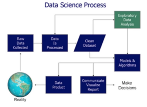
Introduction
The use of Business Intelligence is a current issue of great importance within organizations, with the aim of exploiting their information or generating important intelligence that provides strategic support of the business, to stay current in the market or discover new business opportunities. The process of data analytics involves several phases, starting from descriptive analysis and diagnostic analysis and culminating in predictive and prescriptive analysis. In this article I will focus on diagnostic analysis and how it relates to our VMS industry.
The Challenge
To stay relevant, any MSP/VMO program that is providing value should be performing continuous improvements of their operations (among other things). They need to be constantly looking at how they can introduce innovation and process improvements into their program. This means that often program teams are engaging in program improvement projects to “lower this KPI” or “increase that other KPI” as part of their initiative to improve their overall program’s performance and day-to-day operations. These projects tend to be very data and facts hungry for the planning stage of the project where scope and other parameters are being defined but they also need a way to monitor progress (or lack there off) during the execution stage. As a result, one of the first steps when engaging in any MSP/VMO performance improvement projects is to gather data and intelligence on the project topic at hand. This type of information falls in the descriptive and diagnostic analytics phases since it combines “what happened” with “why did it happen” type of information. This means that we also need to get a better understanding if there are data integrity issues with the data before you start to leverage it. Basically, a better understanding of the data obtained in the descriptive stage.
For example, if you were participating on a project that aims at improving on-time fulfillment for contingent labor across the program, you would want to start by getting an understanding of how on-time fulfillment is currently trending, and how major categories (e.g. region, labor category, etc.) are ranking (compared-to-each other), is this year following a similar pattern as last year (YoY), etc., etc. But you should also review outliers, ratio trends, etc. in order to get a complete picture of the situation.
No one disputes that the more you know about the problem you are trying to address the better your strategy (or plan of attack) to solve the problem. Yet, if you are like many organizations these days, you are relying heavily on extracting data from your transactional system (e.g. VMS) into and Excel-driven processes for coming up with the intelligence you need for these projects. In many cases, you do not even have the time (or stomach) to combine all the needed datasets (e.g. Requisitions, Releases, Assignments, Spend) look into it and basically go with your “gut feeling” vs data driven decision-making.
Subsequently, there is no defined methodology for how to perform such explorations and discoveries. Even when companies leverage market-leading BI tools such as Power BI, QuikView, Spotfire, Tableau, etc. they are mostly engaged for creating executive dashboards versus creating tools designed to support their data exploration discovery and diagnostic analysis process. Unfortunately, this activity is handled in a very inconsistent and often manual way across many organizations and even in many occasions leveraging mostly excel.
In addition, quite often, Business Units that are looking to take on a process improvement project, are confronted with the reality that they are competing with other company priorities for the same precious IT & Data resources. As a result, many project’s data intelligence gathering needs end up being supported by someone that may not have the skills to perform effectively all the facets of the process (data Extract, Transformation, Load (ETL), mappings, visualizations, etc.). If you are lucky, whomever is doing this work, took the time and effort needed to “study” the data, identify possible areas that should be excluded for valid reasons, and can offer the requestor of the data some insights about the dataset itself that was used. Unfortunately, that is not often the case. For example, if in your next QBR, you are told that the workflow step “Time to Shortlist a Candidate” is moving in the right direction you want to high-five the team but then, after further questioning the data, you are told that the numbers are based on just 25% of the program volume because that particular metric is not being captured by the VMS for a given region or category (data integrity issue), then that trend might not earn the “high five” reaction even if still a positive win. This type of data integrity issues are present in many VMS systems due to the complexities of today’s business workflows and VMS configuration flexibility. And YES, this happens very often, and many clients are not even aware of it.
Finally, there is also a lack of understanding in the business community around the fact that different views into the data can yield different “understandings”. That no one chart can tell the whole story. Relying solely on intelligence from a Bar Chart or Line Trend Chart, could easily cause you to miss an important insight about what is going on in your program. Nowadays, if you want to have the full picture (or as much of a picture that is possible with the available data at hand), then you need to look at the data from as many angles as possible in the least amount of time. For this you need both a methodology but also tools and technologies that can help support the methodology.
Seeing the full Picture
It has been proven that our visual perception is faster to gaining understanding than any other way of communication as proved by Anscombe’s Quartet. 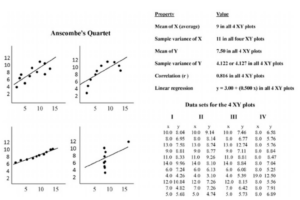
These datasets were constructed in 1973 by the statistician Francis Anscombe to demonstrate both the importance of graphing data before analyzing it and the effect of outliers on statistical properties. Anscombe encouraged statisticians to explore the data, in addition, it is the easiest to learn and become reasonable knowledgeable without a significant amount of up-front work… all you need to do is look and understand how to interpret what you see. This is where visual EDA (Exploratory Data Analysis) comes into play.
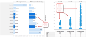
Here is another example where the bar chart results look similar, but the box plot tells a different story:
Introducing EDA
In statistics, Exploratory Data Analysis (EDA) is an approach to analyzing data sets to summarize their main characteristics, often with visual methods. A statistical model can be used or not, but primarily EDA is for seeing what the data can tell us beyond the formal modeling or hypothesis testing task. Exploratory data analysis was promoted by John Tukey to encourage statisticians to explore the data, and possibly formulate hypotheses that could lead to new data collection and experiments.
How does Exploratory Data Analysis help your business and where does it fit in?
Exploratory Data Analysis provides utmost value to any business by helping data scientists and the business owners understand if the results they’ve produced are correctly interpreted and if they apply to the required business contexts. Other than just ensuring technically sound results, EDA also benefits stakeholders by confirming if the questions they’re asking are aligned with reality.
EDA could turns up unpredictable insights – ones that the stakeholders or data scientists wouldn’t even care to investigate in general, but which can still prove to be highly informative about the business. Potential use-cases of EDA are wide-ranging, but ultimately, it all boils down to this – EDA is all about getting to know and understand your data before making any assumptions about it or taking any steps in the direction of Data Mining. It helps you avoid creating inaccurate models or building accurate models on the wrong data.
Performing this step right will give any organization the necessary confidence in their data – which will eventually allow them to start deploying powerful machine learning algorithms. However, ignoring this crucial step can lead you to build your Business Intelligence System on a very shaky foundation.
Technologies
Most, if not all of the tools in the market do not offer (out of the box) analytics solutions that target this “diagnostic or exploration” stage which is why most organizations are still relying on Excel to drive the intelligence gathering they need to drive their projects and decision-making.
How about Excel?
Excel is a great tool for storing, manipulating data, and when used as a spreadsheet but is not great at supporting data needs that go beyond the spreadsheet and database aspects. When leveraged as an adhoc analytics tool, it forces your team to, in essence, start from scratch, every single time they need the kind of intelligence and information about the program they should be getting. In addition, it does not enforce any standards or support data governance. On top of that, it becomes a liability when the author of the Excel reports you have been using leaves and you need to make new changes or adjustments. In summary, many companies are still relying on Excel because out-of-the-box solutions from the VMS vendors and MSP service providers.
Some programs have resorted to leveraging data analysis tools like Tableau, QlikView, Spotfire, Power BI, etc. which is a definitive improvement but could also end up being a significant investment to get it going and maintaining the solution. While these solutions do allow the user to “build” their own visualizations these are usually done in a way that it is not a full solution nor following data-governance guidance from the start. In some cases, switching to one these technologies results in a more glorified version of Excel… prettier but still not achieving the level of insights about your VMS program that you would want before engaging on any performance improvement projects. This is because, most organizations that invest in such tools are more focused on creating custom executive dashboards rather than building analytics tools that are designed to better support the diagnostic, exploration and discovery steps in the process because, even in those tools, it is time-consuming to build production-ready solutions from scratch every time a new dataset needs to be analyzed. This challenge is compounded when the intelligence needed for a given project might cross several datasets that need to be joined and/or mapped somehow. The reality is that this is something that is happening across most business units within your typical organization. Many reporting and project teams that are in need of extracting more intelligence from the data are still relying on Excel to extract such knowledge which result in limited knowledge with “blind spots” into what is going on in reality. On top of that, is not very scalable, error prone, and time-consuming.
Conclusion
Continuing improvements should be one of the primary goals of any MSP/VMO program, yet most programs are not extracting maximum value from their VMS data. Visual EDA could be one of the answers.
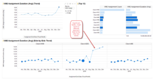
Visual EDA tools provide a way to easily view datasets from different angles with visual techniques (e.g. Ratio Trend with Small Multiples) that unleashes exploration creativity and maximum understanding. All using visual methods that can be easily digested and a skill that all of us have what it takes to become experts…. Our own eyes.
Even in the context of AI or machine learning, EDA is a crucial component since it can help provides the context needed to develop an appropriate AI/ML model and be in position to confirm and interpret the results and recommendations correctly.